
Dorée
Dorée is a jewellery brand created with the idea of bringing bold, timeless, premium jewellery designs to South Africans in a sustainable way.
Carefully designed and crafted in a local studio, the design ethos is creating elegant and timeless designs without following trends.
Dorée believes in quality over quantity. Each piece is uniquely expressive to complement your individual style.

What did we conclude?
Through a strategy and discovery process, we determined the purpose and values of the brand which lead to the right voice and personality for Doree in order to appeal to its intended audience.

Design Process
Doree is intended to last forever.
The brand implements a circular economy whereby tarnished jewellery is repaired and redistributed rather than discarded.
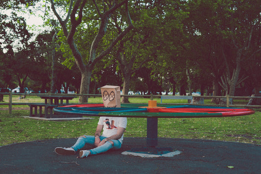
With this in mind and combined with the strategy, we developed a timeless aesthetic for the brand. Clean, bold, and elegant with vibrant soft colours.
The photography has natural backgrounds with strong lighting to reflect the design ethos.
More Projects
View all-
Puppet Clothing
Mental-health focused ethical clothing designs
Puppet Clothing
Mental-health focused ethical clothing designs

